A Midwest-based Govtech company becomes a landmark brand in their industry
Complaining about the inefficiency of local government is an American pastime. Anyone who’s ever spent hours going through an antiquated permitting process with their municipality has likely thought to themselves, “there’s got to be a way to do this online.”
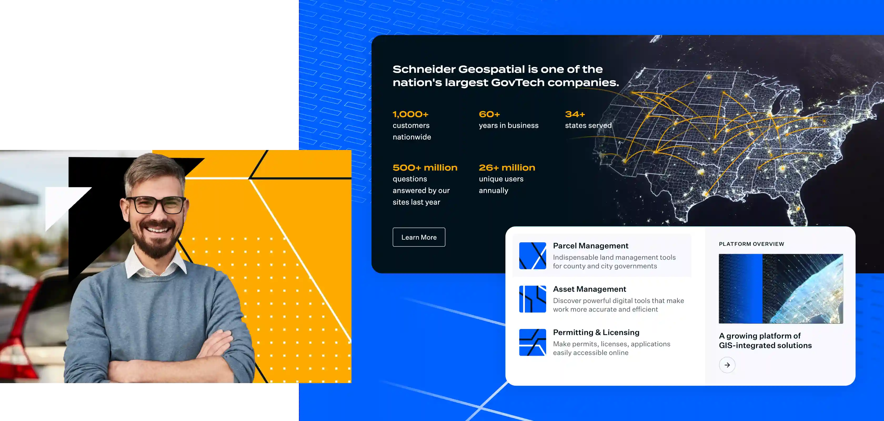
Thankfully for cities and counties across the country, Schneider Geospatial exists to save them from being the subject of public banter. Schneider provides digital solutions that help to efficiently manage property records, public assets and municipal systems. They deal in three primary areas: parcel management, permitting and licensing, and asset management.
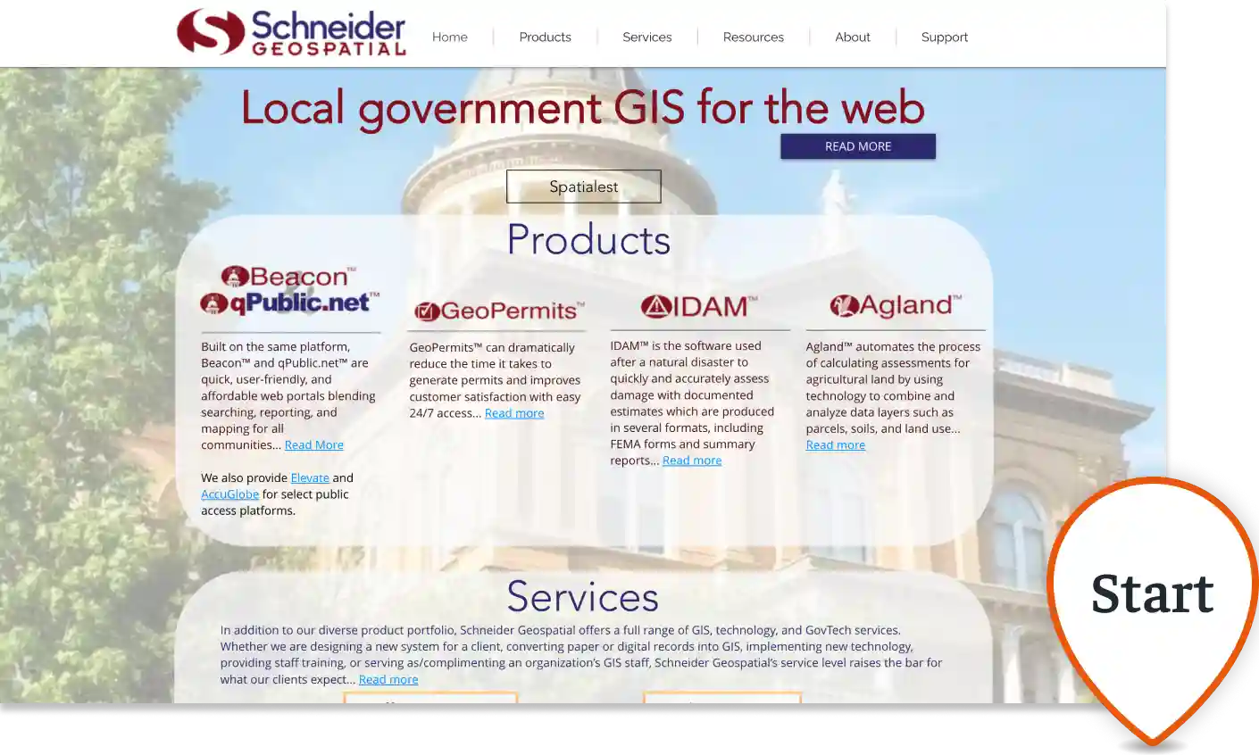
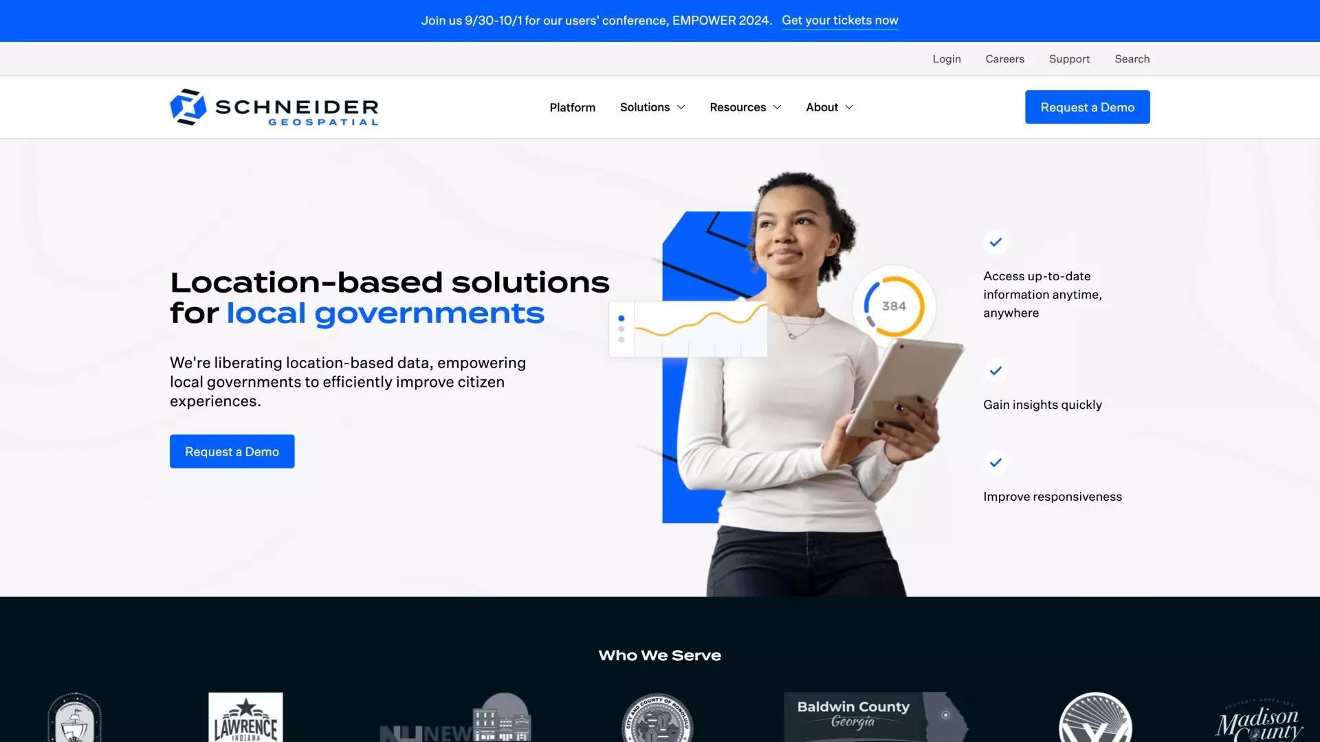
Schneider is a standout company in the GovTech space, but if you had stumbled across their website prior to 2024, you probably would have mistaken them for an outdated public utility company.
Find out how they transformed their brand, their digital experience, and their public perception through years of intentional marketing.
Starting the journey with the Schneider
Schneider streamlines entire county auditor websites and transforms them. They bring in a ton of meaningful data, connect that data into a platform for those same county auditors or constituents, and give them a way to meaningfully access it. This is really great work, but their old brand didn’t communicate that.
Schneider decided it was time to build a new website and redefine their corporate messaging.
At the time, they were going to market with two main services and building a cohesive solution platform. But as we went through the redesign process with their team, their solution offerings expanded to include a third service, and we had to re-think their corporate messaging.
Schneider's Roadmap
Schneider knew they needed help. That’s where USDP came in. Our mission was to convey their complex, but sleek operation.

Strategic Direction: planning for a transformation
We met with Landon Ortiz, Vice President of Marketing, and we went over the big picture. Where did his team want to take the brand, and how did they want the website to reflect that?
Initially, we considered paid advertising. Schneider was hungry to continue their growth, so we initially considered paid advertising. Schneider was a brand that had grown through three generations of a family and had numerous branded sub products. Schneider’s product names were well-known, but they needed to re-establish Schneider Geospatial, the platform. It lacked a cohesive brand identity. We decided to forgo advertising and focus instead on a solid brand for people to land on. We planned a content and design overhaul to do just that.
We aligned on the project’s vision and purpose. We started like we do with any rebrand. We asked a lot of questions. What did the Schneider team want their brand to feel like? Who did they want it to speak to? What did they want this digital transformation to accomplish? Schneider had a mission to highlight their many connected services in a clearer, visually appealing way.
We discussed everything from new logos, to colors, to brand patterns. On the design front, what were some colors to stay away from or some symbols to lean into? We looked at other brands in their field and brainstormed how to differentiate Schneider’s industry leadership.

Messaging and Content: defining the spirit of the new brand
Schneider had a solid internal handle on the direction of their messaging, but they needed creative assistance for putting the pieces together on their website.
Schneider offered multiple different product solutions but they were too disconnected. They needed to wrap their offerings into a compelling story. That’s where the content team came in. Schneider walked through the “hero's journey” with USDP’s writers as a story-telling and branding exercise. They discussed who they wanted to be and how they wanted that narrative to resonate with their audience.
The team made discoveries about the new direction for the brand. Through the messaging discovery process, an exercise that involves multiple conversations about the mission, vision, and offerings of the client, the Schneider team was able to identify and refine the fact that they were also a land and asset company, in addition to parcel management and permitting and licensing. This would serve as a pivotal decision moving forward for the entire marketing project and their company as a whole.
Schneider’s brand platform and services offerings were finally clearer. Midway through the content exercise meetings, the Schneider team decided to bring on permanent licensing as a service. The content team was able to roll with the punches as Schneider decided in real time what direction their company was going and what was most important to their customers.

Branding: beginning the makeover
With the brand message in place, Schneider was itching to bring it to life visually. Our designers got to work.
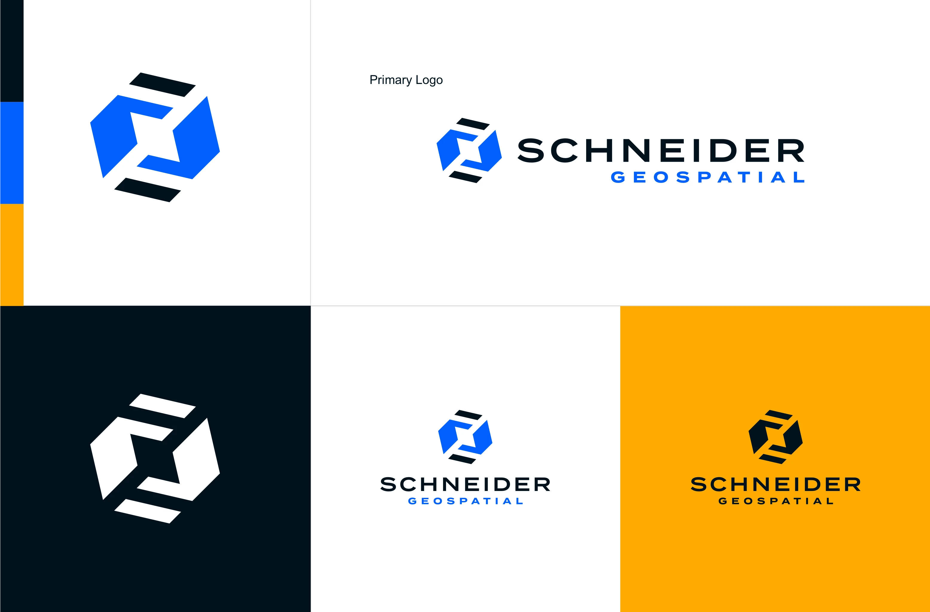
We didn’t just share one logo. We came up with a dozen different marks for the Schneider team to look at and provide feedback on. Each mark was tied to some aspect of the business. The design team thought strategically about building a brand that was not only clean and appealing but also allowed Schneider to shine as the exceptional company that they are. The brand needed to align with the big things that the company was accomplishing for their clients.
We brought the brand to life. Just showing a logo on screen wasn’t enough. We wanted to present how that mark would look when living contextually in different marketing spaces including the website, trade shows, lanyards, business cards, clothing, and reports.
A new logo was born. After a few iterations and lots of feedback sessions, we landed on a modern logo that the Schneider team was really excited about and that we were proud of as a marketing agency.

Website: creating the experience
Once the look and feel of the new brand was in place, we began building the setup of the website and subpages.
A deep dive into market research and the competition. We jumped right into assessing the industry and Schneider’s competitors to choose design layouts to lean into. We developed a few concepts, reviewed them with the Schneider team, and refined the look and feel over a few iterations.
A software game changer. We built Schneider’s new site on a cutting edge framework called Sanity, a headless Content Management System. This was a big step forward making the website feel more dynamic and alive compared to the previous site. Instead of waiting on slow load times and mechanical movements, Schneider’s web app with a headless CMS stack provided instant on-screen animation. The website now acted more like an application rather than a clunky government software, leading to more fluidity and a better user experience.
A fresh new website built for easy, everyday updates. We wanted to make sure that the site was easily editable for the client. With a solid foundation and a beautiful new brand, the team at Schneider was able to add their touch by uploading new posts, updating information, and swapping out visuals when needed. The new website was fast, and Schneider now had the tools at their disposal to take ownership of their website without having to constantly call us.
Collateral: years of brand activation
A brand doesn’t just live on websites and business cards. We’ve delivered numerous unique collateral pieces for Schneider throughout our partnership.
From trade show banners to Christmas cards, we continue to produce custom collateral to help Schneider close deals more effectively.
The Private Equity Angle:
Schneider’s launch of their new brand was an exciting development for their private equity principals. The firm that had invested in them was looking for a substantial transformation without throwing away the company’s identity. Shareholders and the public alike were proud and excited about the brand’s new positioning from both a messaging and visual perspective.
Emphasis on uniformity of look and feel with the website and products. During the rebrand Schneider was careful not to overdo the brand and get disconnected from the company’s legacy. They wanted to communicate the continuity of all they had accomplished but give the look and feel a second life. The finished product still felt familiar, and it didn't overpromise to their prospects.
Instead of clamoring for conversations, customers were flocking to their booth. Schneider first debuted their new brand at a large international conference for their industry. After the rebrand, they went from fighting for facetime to a spontaneous line forming at their booth. With three clear services, they were able to solve their problem of obscurity and connect with customers that weren’t aware of the breadth of their offerings.
Being both seen and understood in the marketplace. Instead of having to explain their services, people were already asking for more information. Prospects were finally able to see the full extent of their services; parcel management, permitting and licensing, and asset management.
Going beyond the results
An unanticipated benefit of the Schneider Geospatial rebrand was success on the recruiting side of the business. Job prospects were now seeing Schneider as a tech company with a solid brand and a cohesive mission; a place they might want to work.
The rebrand also helped Schneider’s leadership to connect with legacy team members and present a cohesive solutions platform that everyone could get behind.
The Schneider team could not have predicted the large impact that a rebrand and website redesign would have on their company, both internally and from a leads and revenue standpoint. Now, when representatives see success at trade shows and voice their pride in wearing the new logo and colors, the investment is clear.
The rebrand has strengthened the company and made a difference in the way that prospects engage with them. New, full platform deals are hitting their pipeline. Clients can understand that Schneider is a multi-service platform and they want to explore buying all three solutions. Without Schneider’s commitment to seeing the rebrand and messaging exercises through, these conversations might not have happened.

A Note from Landon at Schneider
“We landed in a really good spot and I think we have a really cohesive brand. Working with [USDP] on [the messaging], we wouldn't have gotten there without [them]. Even with AI, we probably wouldn't have gotten that quality of content.”
- Landon Ortiz, Vice President of Marketing