Our Work
View Our Work
Crafting company stories that captivate, one pixel at a time.
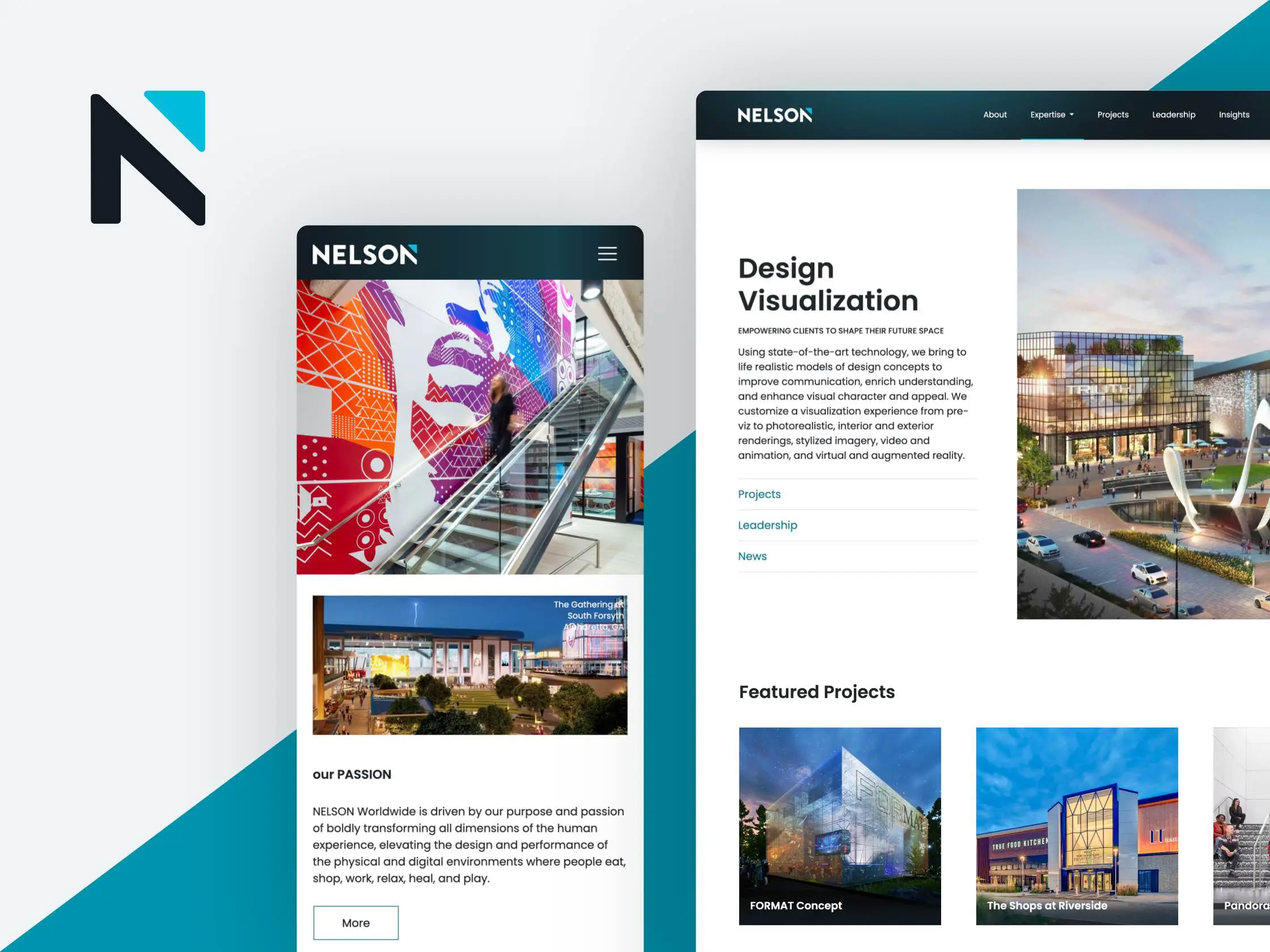
Nelson Worldwide
Nelson Worldwide, an award-winning firm specializing in architecture, interior design, graphic design, and brand strategy, asked USDP to revamp its website to meet evolving goals and reach a broader audience.
View Project
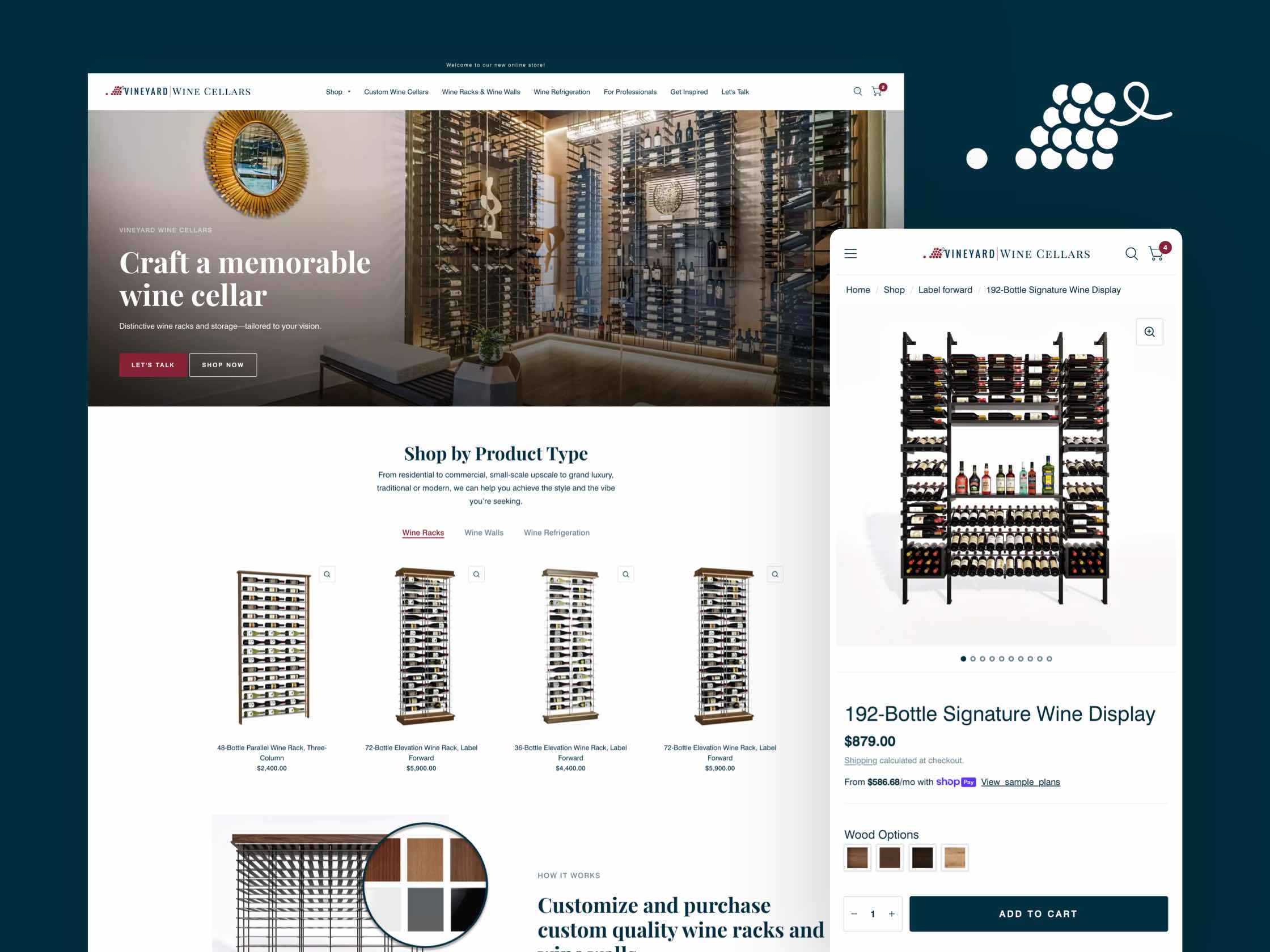
Vineyard Wine Cellars
Building a wine cellar is complicated. But with the wine display and storage experts at Vineyard Wine Cellars.
View Project

Bridgeway
USDP designed Bridgeway's website to reflect its new brand identity and strategy, creating a unified platform that addresses the diverse needs of its stakeholders, ensuring Bridgeway's seamless transition into a cohesive specialty freight leader.
View Project
USDP Sizzle Reel
Check out our sizzle reel to see what we’ve been cooking up! This highlight video showcases our latest and greatest projects, giving you a taste of our creative process.
View Project

Grow your Career at PharmaCord
PharmaCord works on behalf of pharmaceutical manufacturers to help patients who need life-saving medications to receive them.
View Project