Cincinnati Experience Brand
Posted: Dec 11, 2020
Last Updated: Dec 11, 2020
Cincinnati is a city that we all know and love here at US Digital Partners. It’s our home! But, what do people outside of our great city know about it? Turns out, not a lot. That’s why there is Cincinnati Experience. CX takes the city’s greatest elements and gives the world a narrative of who we are, what we do, and why we love our city. When it came to revamping the brand, we took our Brand Boost approach to spice up the style and take the brand to the next level.
We wanted something modern and sleek with a typeface reminiscent of the Art Deco style that Cincinnati identifies with. We paired the typography with a stark black and white color scheme that jumps off the page when layered with color photography.
Digital Marketing Services Used: Branding.
Features

This modern brand focused on a black and white bold style that was accented by the warmer hues of deep purple, plum, and tan.
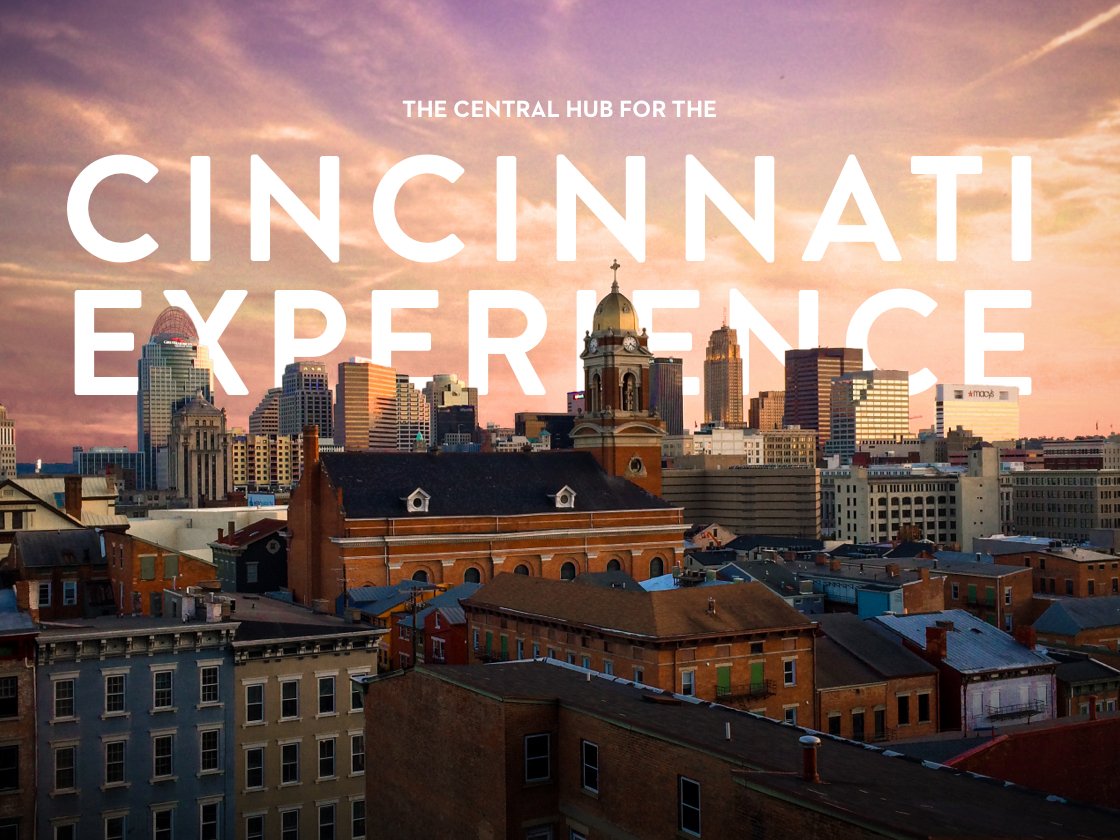
Much of the color scheme and brand style was inspired by the grit and the rich history of the city of Cincinnati. The homepage dives into this by introducing you to the brand with large, spanning images in full color.
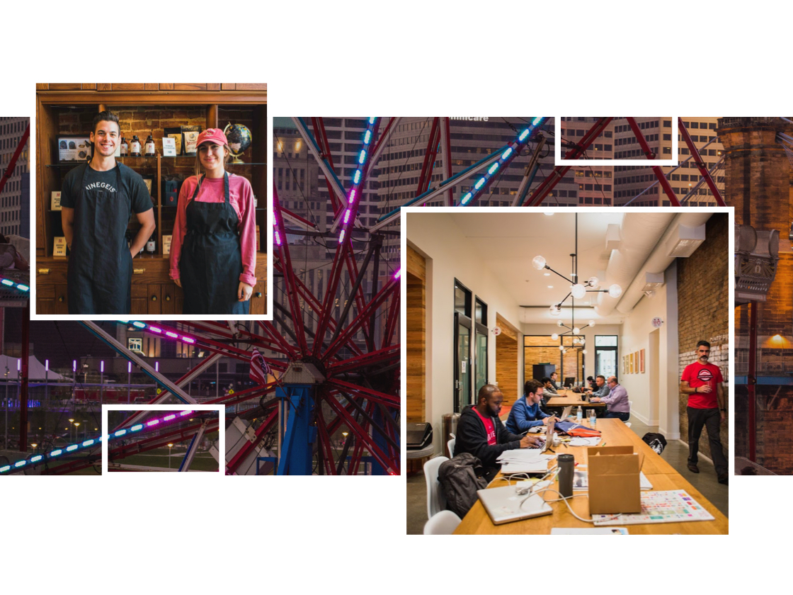
Images bring most of the color to the brand and are organized with style and pattern in mind. Overlapping image sections, outlined image containers, and fades are included to create visual interest.